---
title: How to Change the Appearance of your Discovery Site?
description: "Tip: make sure you have logged into Discovery Site before proceeding with the article. "
---
[Skip to content](https://help.edly.io/docs/how-to-change-the-appearance-of-your-discovery-site-0#main-content)
English
Show submenu for translations
-1.png?width=100&height=75&name=Edly%20by%20Arbisoft%20(Red%20and%20Gray)-1.png)
Open main navigation
Close main navigation
- English
Show submenu for translations
- Visit edly.io
Visit edly.io
Hello. How can we help you?
- There are no suggestions because the search field is empty.
1. [Edly Knowledge Base](https://help.edly.io/docs?hsLang=en)
2. [Discovery Site](https://help.edly.io/docs/discovery-site?hsLang=en)
3. [Settings and Tools](https://help.edly.io/docs/discovery-site?hsLang=en#settings-and-tools)
# How to Change the Appearance of your Discovery Site?
### Overview
Your Discovery Site acts as the public-facing digital storefront and marketing catalog for your learning ecosystem. Customizing its global appearance allows you to match the platform's presentation layout directly to your institution's corporate design guidelines. Revisions made inside the customizer engine update your storefront dynamically across your central homepage canvas, course listings grid, and registration workflows.
**Tip:** Ensure you have logged into your **WordPress Administration Panel (`/wp-admin`)** using an account with Administrator or Editor privileges before proceeding.
### Step-by-Step Configuration Lifecycle
#### Step 1: Open the Real-Time Customizer
1. Access your WordPress dashboard workspace using your administrative credentials.
2. From the left-hand navigation sidebar menu layout, go to **Appearance**.
3. Select **Customize** from the expanded sub-navigation choices row.
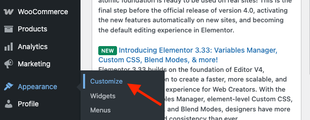
The system launches the unified **WordPress Customizer** application workspace. The screen divides into two distinct operational panels: a configuration options column on the left and a responsive, live-updating visual preview canvas of your live homepage on the right.
#### Step 2: Update Core Site Identity & Branding Assets
Establishing your brand identity is the foundational step in configuring your site architecture.
1. Click on the **Site Identity** (or *Header Options*) sub-tab block in the left customizer column.
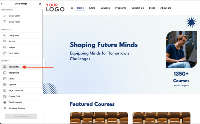
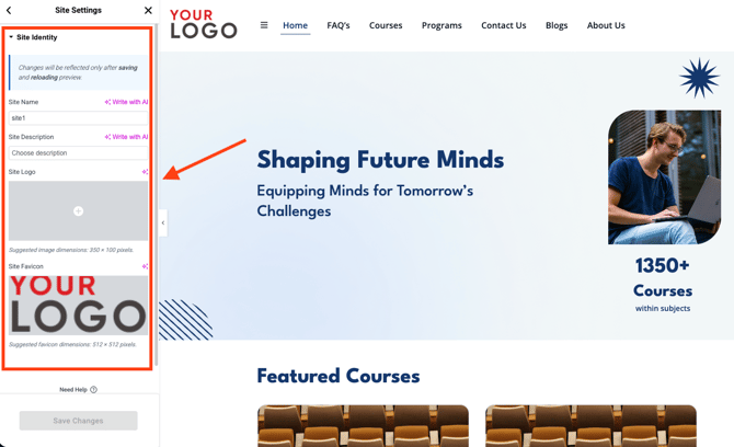
2. **The Main Platform Logo:** Locate the primary logo field and click *Select Image*. Drag and drop your organization's official high-resolution branding graphic from your local machine, add accessibility Alt Text, and click choose.
3. **The Site Icon (Favicon):** Scroll down to the *Site Icon* block module field. Upload a clean, square orientation image file (ideally `512 x 512` pixels). This asset functions as the miniature branding graphic that loads natively inside student web browser navigation tabs and bookmark lists.
4. **Site Title & Tagline:** Update the baseline text string fields to declare your institution's official name and core marketing value proposition.
#### Step 3: Configure Global Typography & Color Scheming
To maintain visual consistency, alter the foundational design rules that control your text and layout surfaces.
1. Navigate back to the main customizer index level and expand the **Colors** or **Typography** settings panel.
2. **Brand Accent Coordination:** Update the hex value selector boxes to assign your explicit brand colors across three primary interaction states:
- *Primary Color:* Dictates the accent colors of navigation menus, section underlines, and subheadings.
- *Link / Hover Color:* Sets the color transition highlight that triggers when a learner moves their cursor over a text hyperlink.
- *Button Surface Color:* Controls the default background shading of actionable elements like the **Register** or **Purchase Course** checkout cards.
3. **Typography Scaling:** Use the dropdown typography selectors to assign global font families across your headings matrix (`H1` through `H6`) and main paragraph text elements to optimize readability.
#### Step 4: Adjust Header, Footer, and Structural Menus
The main header navigation bar and the bottom page footer anchor your overall user experience map.
1. Open the **Menus** or **Header Builder** configuration block.
2. Adjust your primary navigation links by arranging menu blocks left-to-right to dictate the layout structure of essential landing destinations (such as *Courses Catalog*, *About Us*, or *Blog*).
3. Expand the **Footer Options** text parameters row to update your organization's physical contact directory coordinates, support emails, and global licensing or copyright text strings (e.g., *Copyright © 2027, Your Academy Inc.*).
#### Step 5: Validate and Publish Revisions Live
1. Review the right-hand visual preview panel to observe how your modified color palettes, asset logos, and typography configurations align.
2. **Audit Device Responsiveness:** Click the miniature monitor, tablet, and smartphone icons located at the bottom-left corner of the option customizer column. The preview workspace canvas will scale dynamically to let you confirm that your design flows display accurately across all mobile viewport screen profiles.
3. Once satisfied with your formatting changes, click the blue **Publish** button located at the very top of the left-hand customizer panel.
### Key Administrative Rules
- **Safe Staging Constraints:** While you are adjusting colors, moving menu blocks, or switching typography configurations, your site visitors will **not** experience any service interruptions. The live changes remain securely sandboxed as temporary draft layouts inside your administrator panel until you explicitly click the final **Publish** trigger button.
- **Functional Boundaries:** Modifying global appearance states inside the WordPress storefront updates only **front-end presentation themes**. It operates completely independently of the core learning data management loops. It will **not** alter your behind-the-scenes course configurations inside **Open edX Studio**, touch any learner grading histories, or alter transactional pricing states inside your integrated e-commerce databases.
- [Discovery Site](https://help.edly.io/docs/discovery-site?hsLang=en#main-content)
- [Settings and Tools](https://help.edly.io/docs/discovery-site?hsLang=en#settings-and-tools)
- [Assets Management](https://help.edly.io/docs/discovery-site?hsLang=en#assets-management)
- [Edly Panel](https://help.edly.io/docs/edly-panel?hsLang=en#main-content)
- [Settings and Tools](https://help.edly.io/docs/edly-panel?hsLang=en#settings-and-tools)
- [User Management](https://help.edly.io/docs/edly-panel?hsLang=en#user-management)
- [Panel Insights](https://help.edly.io/docs/edly-panel?hsLang=en#panel-insights)
- [Panel Dashboard](https://help.edly.io/docs/edly-panel?hsLang=en#panel-dashboard)
- [Themes](https://help.edly.io/docs/edly-panel?hsLang=en#themes)
- [Studio](https://help.edly.io/docs/studio?hsLang=en#main-content)
- [Studio Guides](https://help.edly.io/docs/studio?hsLang=en#studio-guides)
- [Creating a Course](https://help.edly.io/docs/studio?hsLang=en#creating-a-course)
- [Exercises and Tools](https://help.edly.io/docs/studio?hsLang=en#exercises-and-tools)
- [Course Components](https://help.edly.io/docs/studio?hsLang=en#course-components)
- [Course Assets](https://help.edly.io/docs/studio?hsLang=en#course-assets)
- [Re-running Your Course](https://help.edly.io/docs/studio?hsLang=en#re-running-your-course)
- [LMS Administration](https://help.edly.io/docs/lms-administration?hsLang=en#main-content)
- [User Management](https://help.edly.io/docs/lms-administration?hsLang=en#user-management)
- [Open edX E-commerce](https://help.edly.io/docs/lms-administration?hsLang=en#open-edx-e-commerce)
- [Instructor Dashboard](https://help.edly.io/docs/lms-administration?hsLang=en#instructor-dashboard)
- [Learner Experience](https://help.edly.io/docs/learner-experience?hsLang=en#main-content)
- [Learning Management System](https://help.edly.io/docs/learner-experience?hsLang=en#learning-management-system)
- [Discovery Site](https://help.edly.io/docs/learner-experience?hsLang=en#discovery-site)
- [Getting Started](https://help.edly.io/docs/getting-started?hsLang=en#main-content)
- [Open edX E-commerce](https://help.edly.io/docs/getting-started?hsLang=en#open-edx-e-commerce)
- [Learning Management System](https://help.edly.io/docs/getting-started?hsLang=en#learning-management-system)
- [Exercises and Tools](https://help.edly.io/docs/getting-started?hsLang=en#exercises-and-tools)
- [Discovery Site](https://help.edly.io/docs/getting-started?hsLang=en#discovery-site)
- [Edly Panel Management](https://help.edly.io/docs/getting-started?hsLang=en#edly-panel-management)
- [General](https://help.edly.io/docs/general?hsLang=en)
[-2.png?width=34&height=24&name=Edly%20by%20Arbisoft%20(Red%20and%20Gray)-2.png "Chill listening crop-3")](http://arbisoft.com)
[mailto:email@email.com](mailto:email@email.com)
Copyright © 2026, Edly Inc.